Cam AnhMarketing Applicant
Contact
↑ Contents
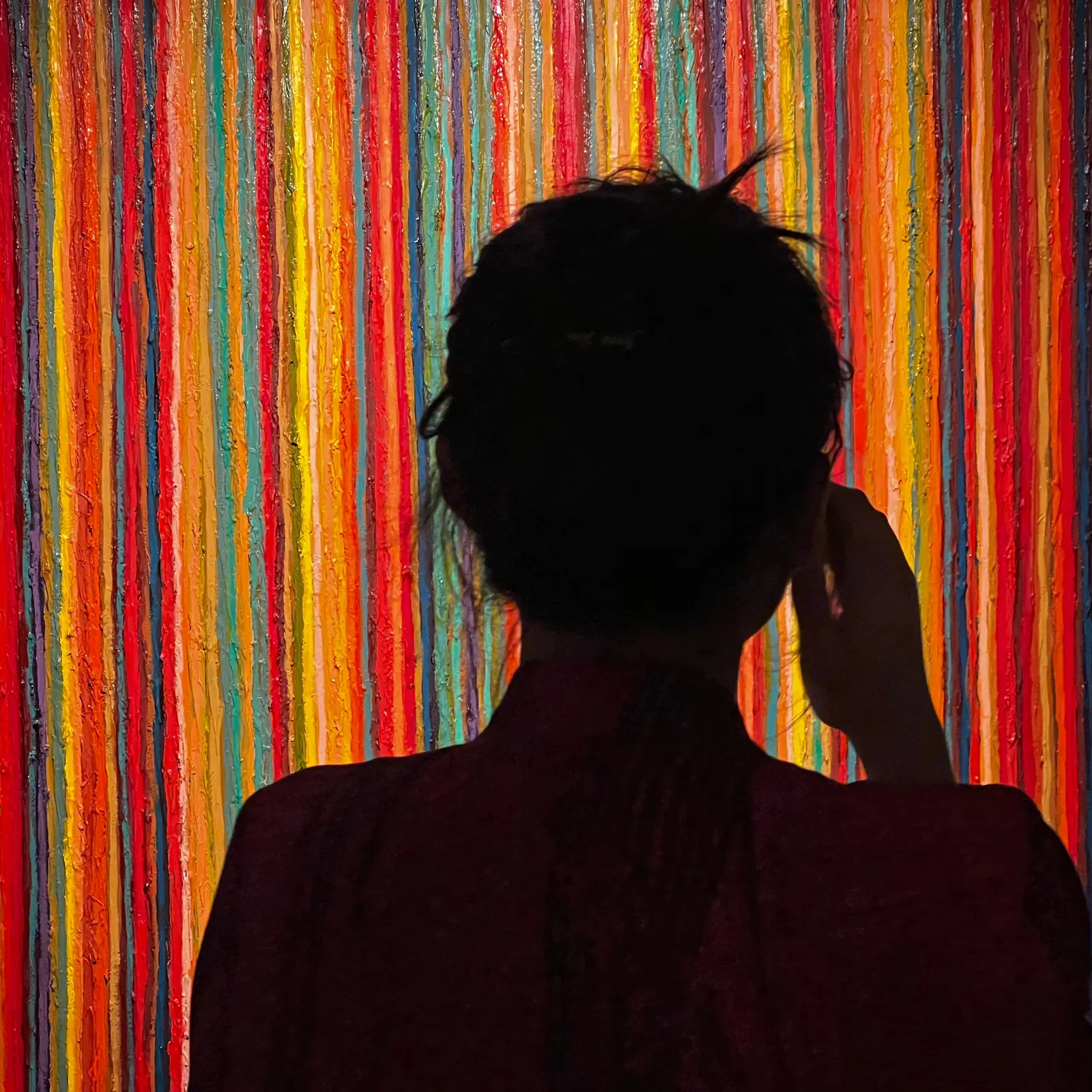
The silhouette of Cam Anh from behind, one hand at her ear, against a wall of thick vertical stripes of colourful paint.

It started with culture

A culture lover who wanted to become a marketer

Marketing Executive · In-house photographer

· Full-time · Aug 2023 – Feb 2024

In search of connection with Hanoi’s people and culture, I found my beginning in art.

As part of the in-house marketing team of a commercial gallery, my brief was never “sell this piece.” It was to carry the spirit, meaning and value of the works to the people who might one day live with them.
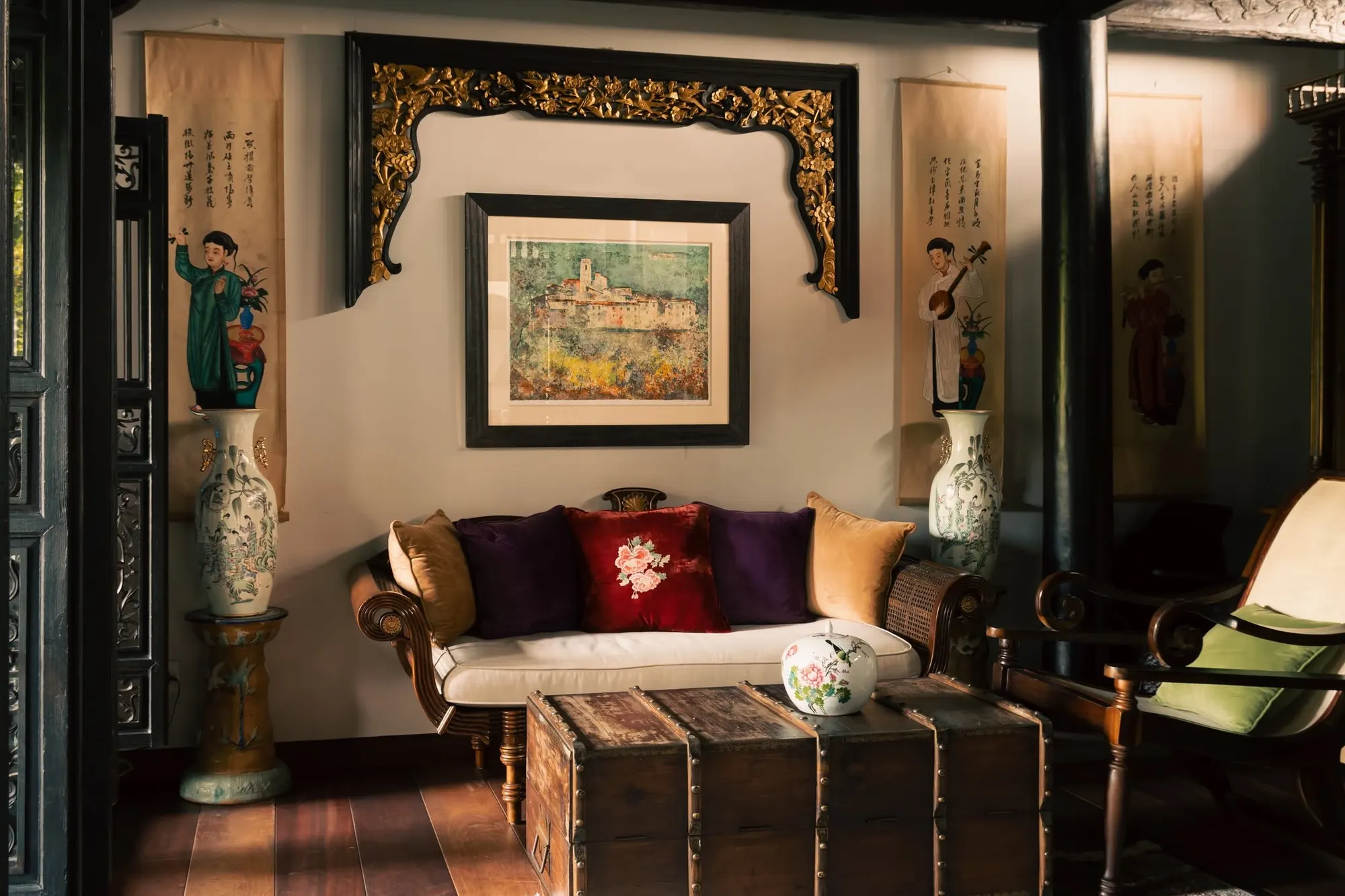
A dark-wood Indochine villa sitting room in warm light: a daybed with plum, red and gold cushions under a framed landscape and a carved gilded lintel, tall painted vases and hanging scrolls on both sides, a leather-bound chest in front.

Highlight Campaign

ACCULTURATION

Art in the Flow of Culture

Acculturation is what happens when cultures meet and keep flowing into one another.

The mission
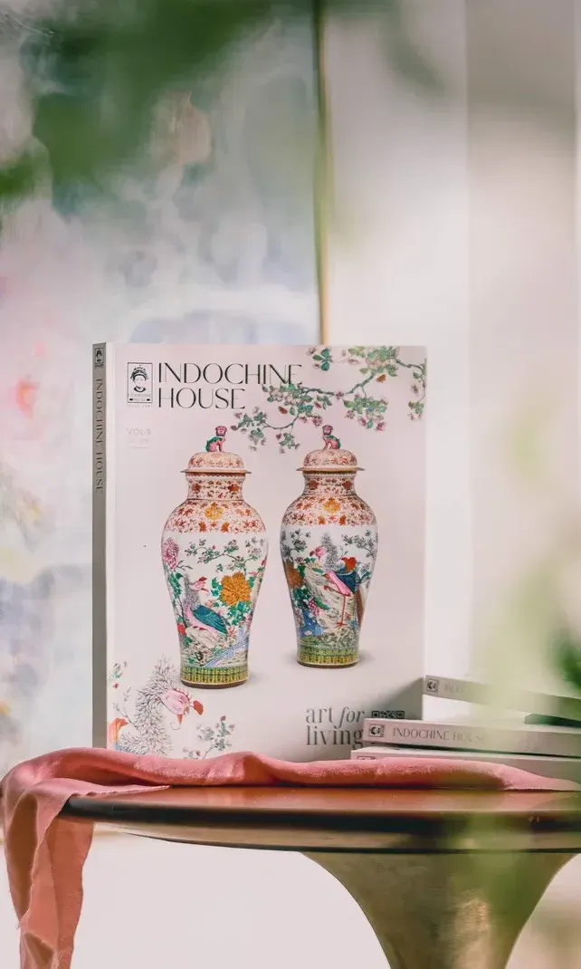
  • The Indochine House catalogue standing on a round table in front of a soft abstract painting.

    Produce the catalogue 03

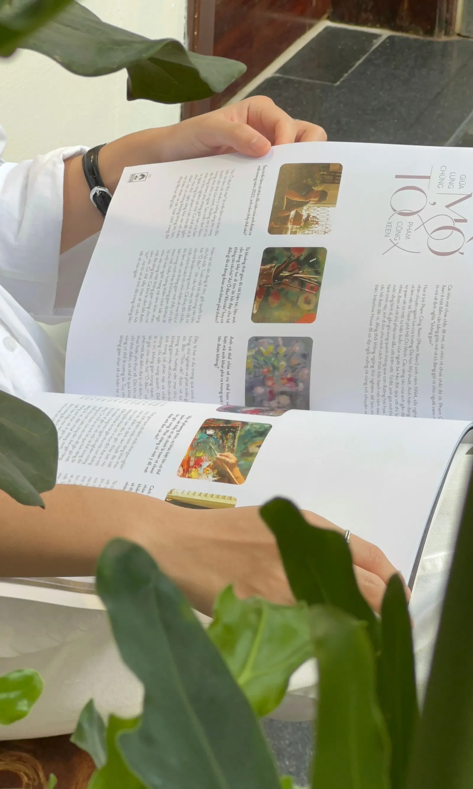
  • A hand turning the pages of the open catalogue, with plant leaves in the foreground.

    Launch it on social media

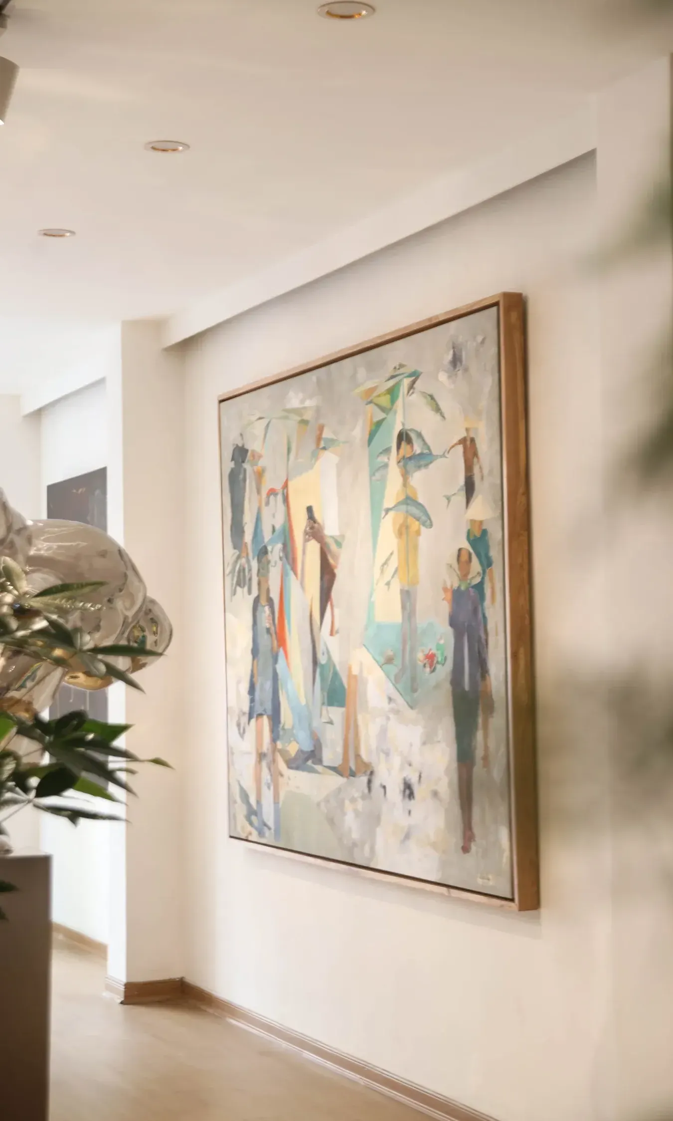
  • A framed painting of figures hanging on a sunlit gallery wall, a plant in the foreground.

    Organise the Acculturation exhibitions

My part: Imagery & Photography
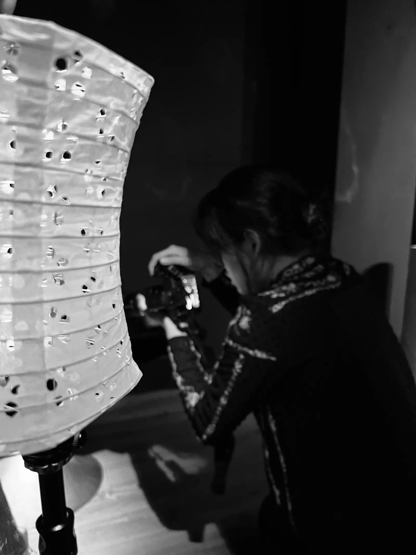
Black-and-white photo of Cam Anh crouching to shoot beside a tall lantern pierced with small holes.
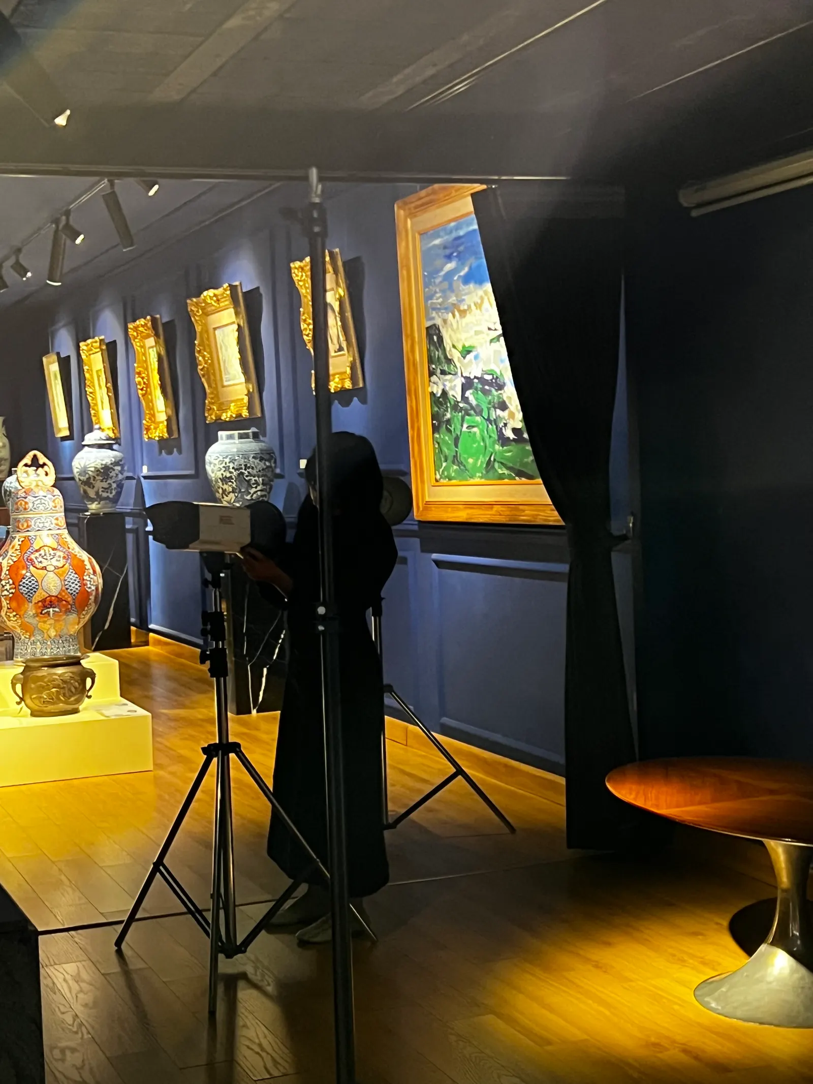
A photographer working in a navy gallery, a single beam of light and a tripod among gilded frames and porcelain.
  • Shaped the campaign’s big idea with the team
  • Built the moodboards
  • Ran the shoots, with the team’s support
  • Produced images and short videos for social
  • Pitched in on the exhibitions

Highlight

Studio visits

I documented artists’ creative processes and listened to the stories behind their work. Their ideas were often abstract. My job was to turn them into something you could see, then decide where each piece should live.
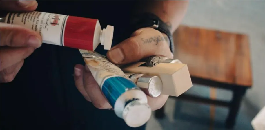
Hands squeezing a tube of red paint and a tube of blue paint at a small wooden table.
An artist reaching for a tube of paint from a wall of shelves lined with paint tubes.
A paint-smeared palette and a handful of brushes held over a wooden stool.
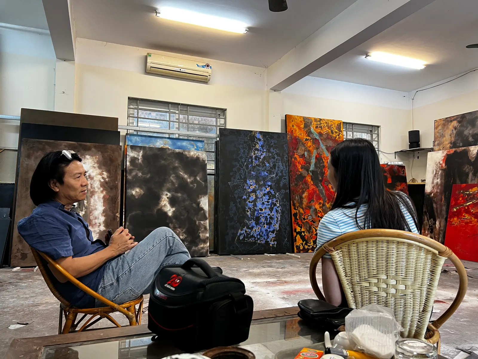
An artist and a visitor sitting in a studio with large dark and orange canvases leaning behind them.
An artist holding up a crowded, colourful painting on an orange panel.
Black trays of cut paper and dried flower petals in many colours on a wooden floor, with scissors.
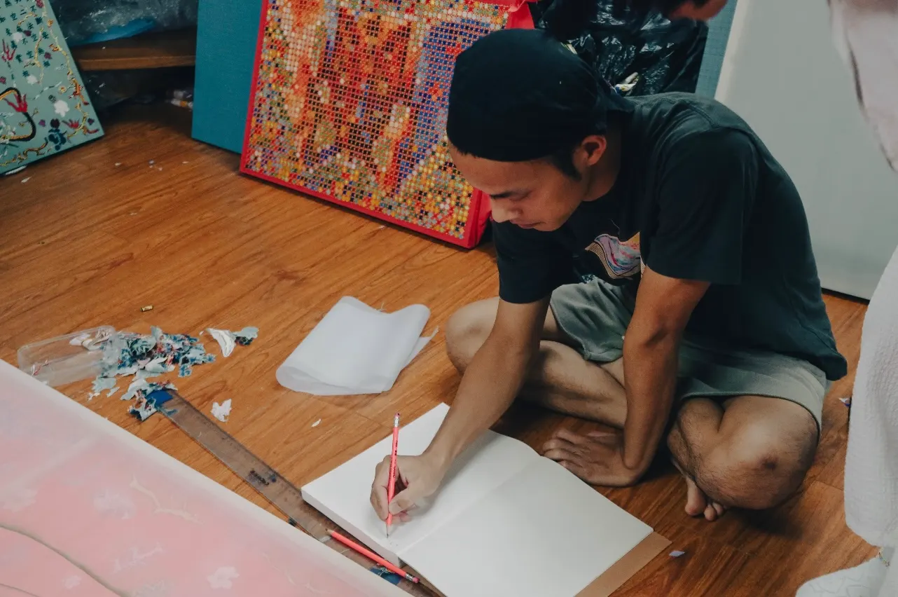
An artist in a bandana sitting on a wooden floor, drawing in a notebook, with paintings behind him.

Two living spaces

We showcased the artworks in two distinct homes: an Indochine villa and a modern apartment, to demonstrate how art can live naturally across spaces, from traditional architecture to contemporary interiors.
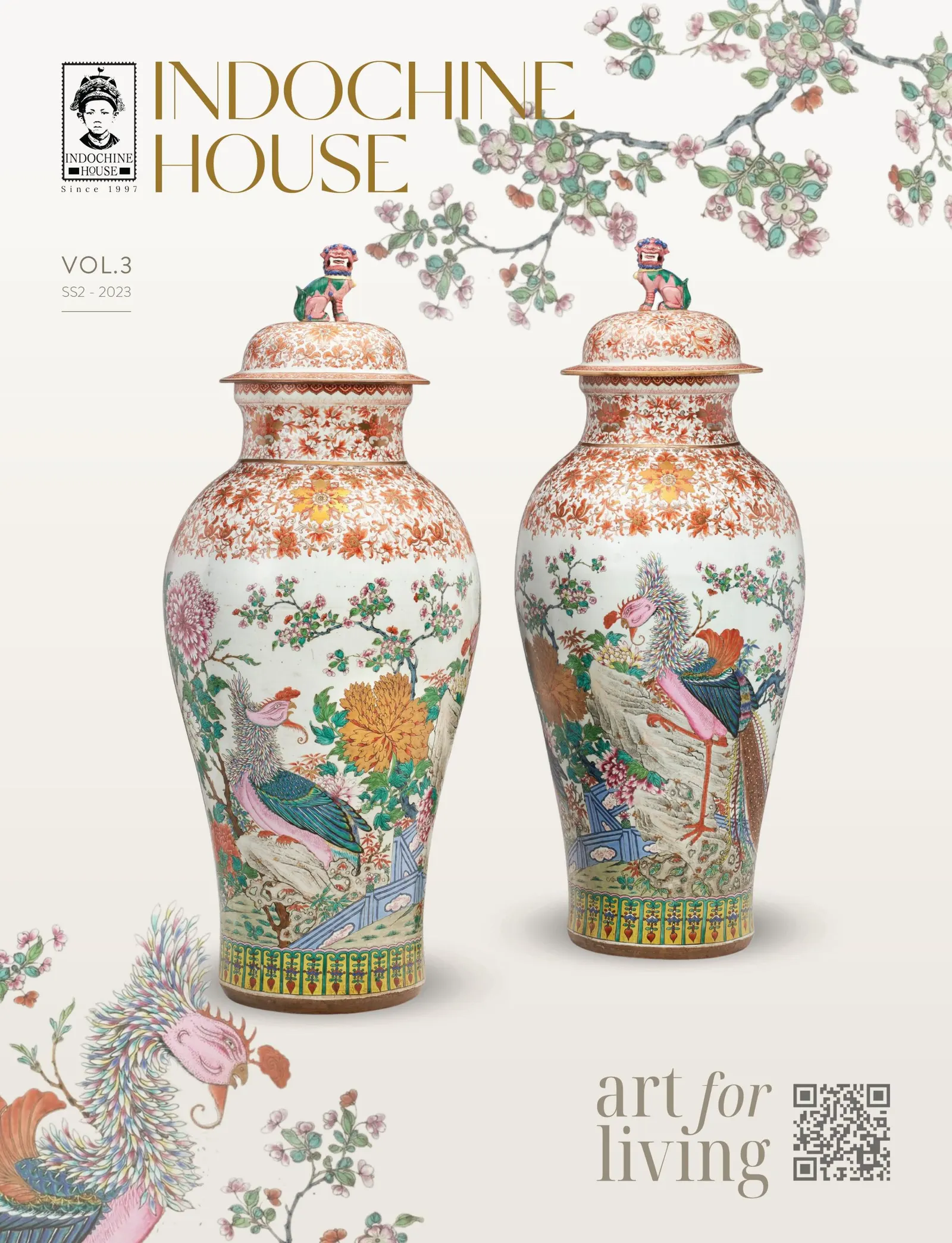
Catalogue 03.The cover of the Indochine House catalogue: two lidded porcelain vases painted with birds, and the words “art for living”.
The long white gallery hall with large paintings on both walls and a silver sculpture at the end.

In the gallery

Back in the gallery, we kept it simple: a classic layout, fresh flowers, and room for guests to move, talk and connect.
Art trained my eye and fed my soul.

It taught me to give form to ideas that don’t have one yet.

And yes, all of it was exquisite, and so tranquil.

But my true dream was…

Indochine villa 16 photos

modern apartment 11 photos

↑ Contents

02

Becoming whole in F&B

Where the culture lover in me found her kitchen

Lam Yên

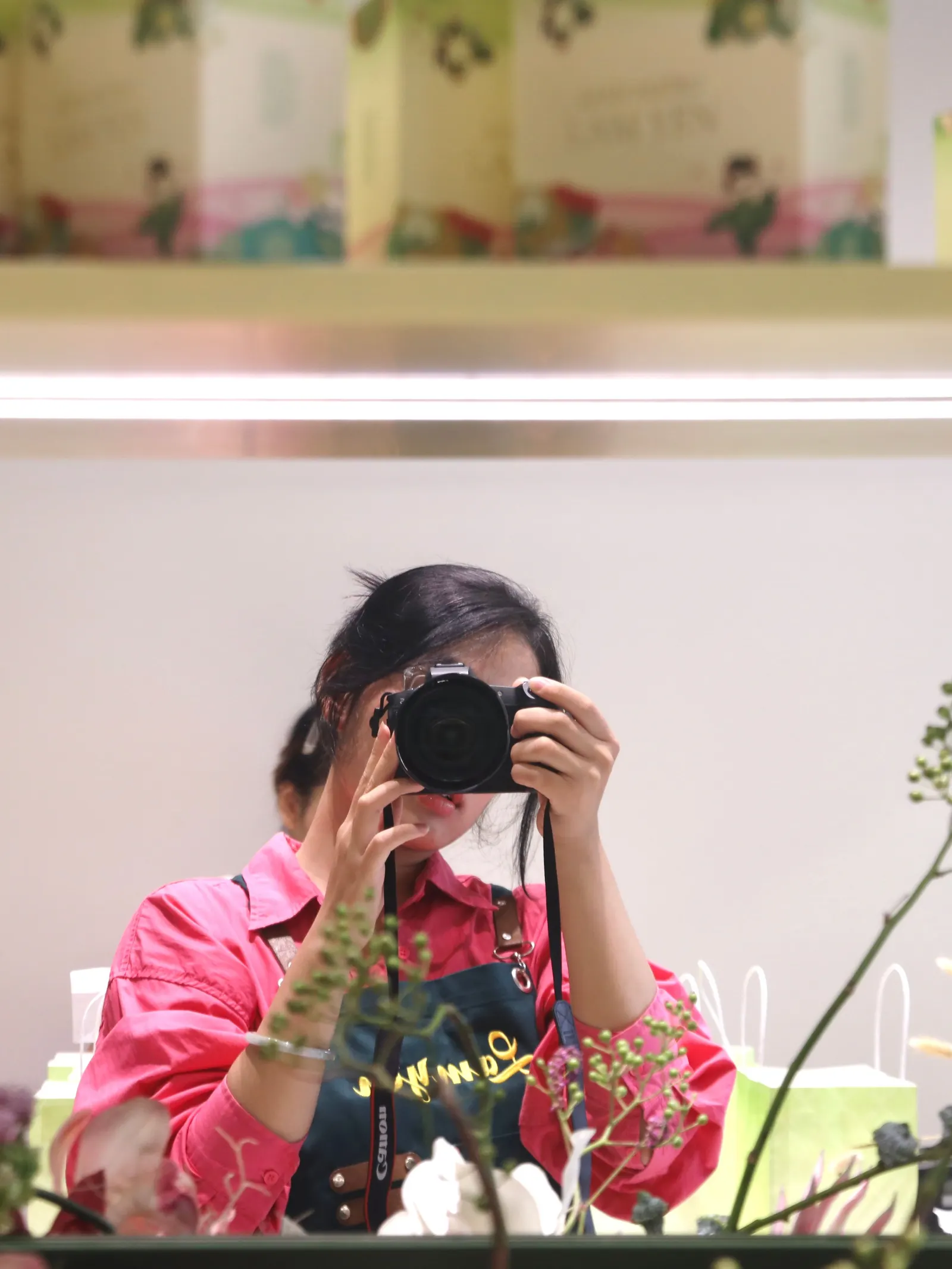
Cam Anh in a pink shirt and apron photographing her reflection with a camera, between shelves of green gift boxes and sprigs of dried flowers.

I worked directly with the brand owner, and with a lead and outsourced teams on the big campaigns.

  • Feb 2024 – Sep 2026 · Full-time
  • Sep 2024 – Jun 2025Operations Assistant to the Brand Owner · Part-time
  • Jul 2025 – Feb 2026Visual Merchandiser · Part-time

How a traditional gift became a daily sweet treat

The brief

Our signature mooncake was a traditional gift. It was bought once a year for Mid-Autumn, to offer on the altar or give as a gift. We wanted three things:

  1. Own the idea.

    Make it clear that ‘Cốm Xào Mooncake’ was created by Lam Yên.

  2. Lead the category.

    Position Lam Yên as the pioneer of creative cốm products.

  3. Open the daily door.

    Turn it into a daily sweet treat, not a once-a-year obligation.

Make it a gift worth owning

THE PACKAGING

We wanted the brand to say three things:

  • Young and creative.

    A young creator’s brand.

  • A personality of its own.

    A bit bold, a bit colourful, easy to spot.

  • Hanoian.

    A touch of tradition, with a handmade feel.

Renewed the whole packaging, from green-and-white to green-and-pink, and added hand-drawn illustrations by a young artist.

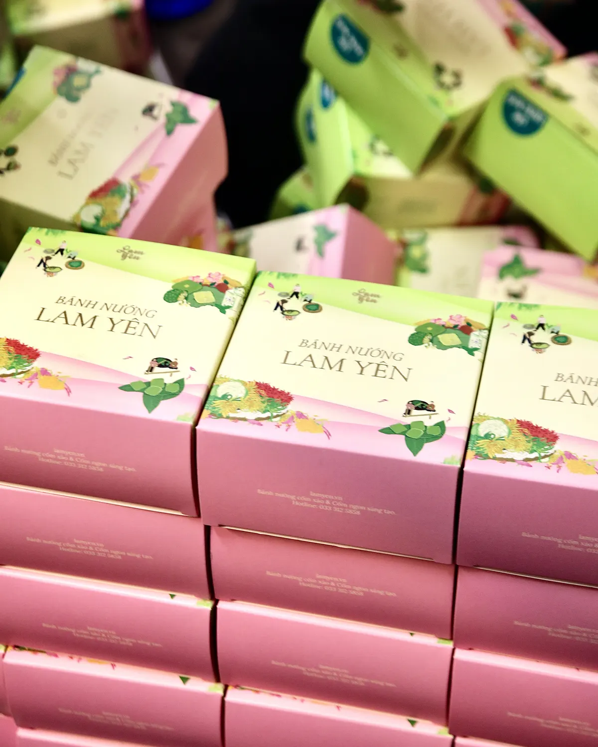
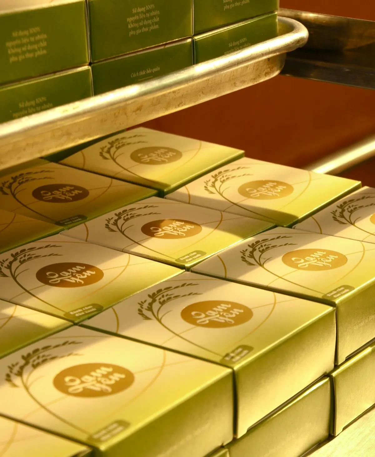
Rows of green gift boxes with gold seals stacked on a shop display tray.Stacks of pink gift boxes lettered “Bánh Nướng Lam Yên”, with green and pink boxes piled up behind them.

The wrapBeen through 2 different stages

1

Our first Mid-Autumn, we tried to join the race of elaborate mooncake boxes, the kind five-star hotels make. It didn’t fit us: too slow to pack at peak season, too costly to produce, and far too seasonal for a brand aiming to be a daily treat.

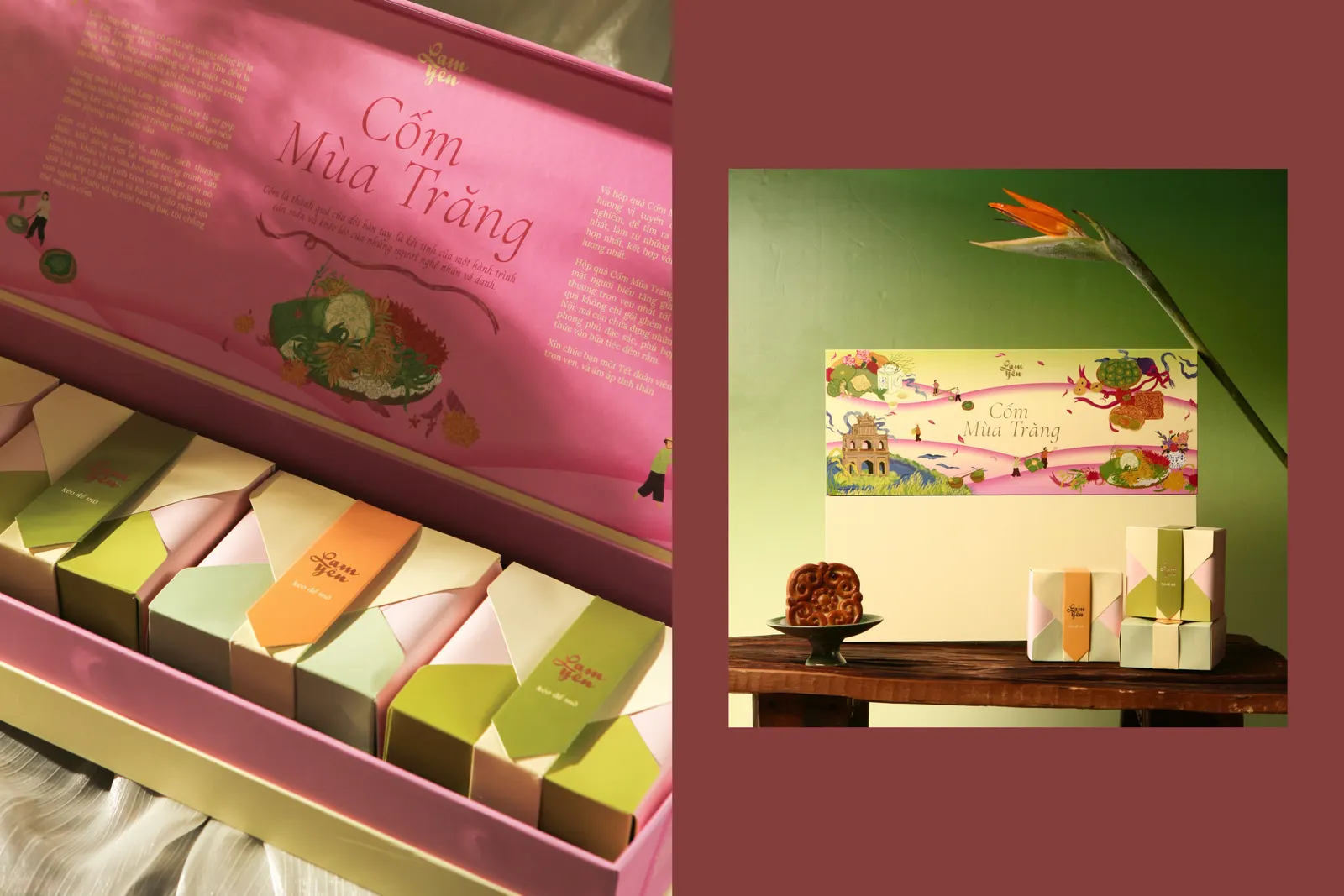
An elaborate pink box of pastel-wrapped mooncakes lettered “Cốm Mùa Trăng”, next to a styled photo of the box on a table against a green wall.
2

So we flipped it: a seasonal wrap for the gift set, and simple, optimised box blanks that we refine each season while keeping them minimal.

A stack of simple orange and red wrapped mooncake boxes carried in both arms outside the shop, beside a red box printed with a mid-autumn illustration.

The paper signature bagPlaying with pattern

At first, my team wanted to put straight onto the bag. But to my eye it looked like a child’s drawing, and many details like that are hard to turn into something customers recognise and remember.

So I said, “Let’s play with pattern and our signature colour.”

We built one from mooncake pattern, in our green and pink, softened with a gradient.

Simple, and instantly recognisable.

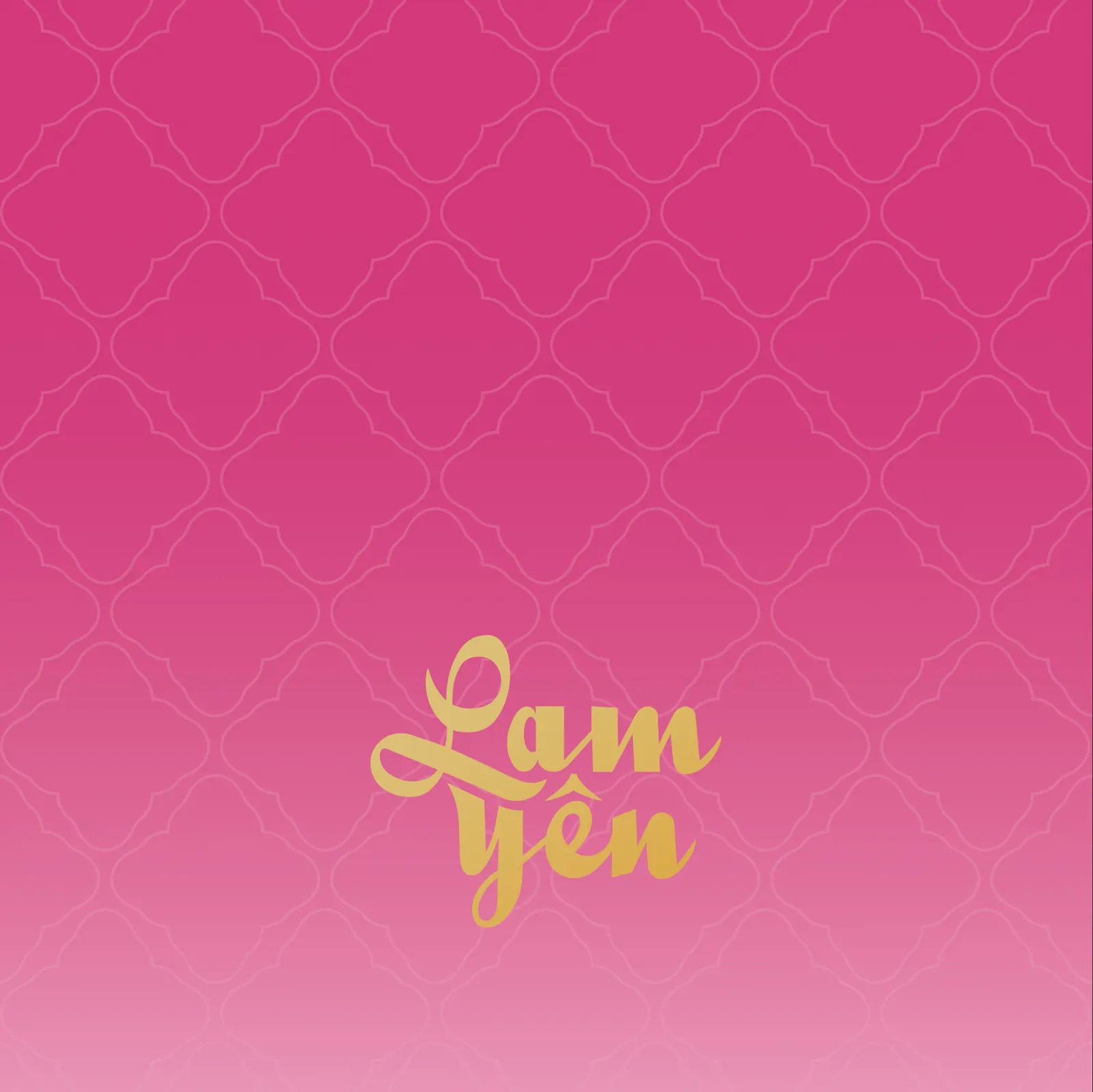
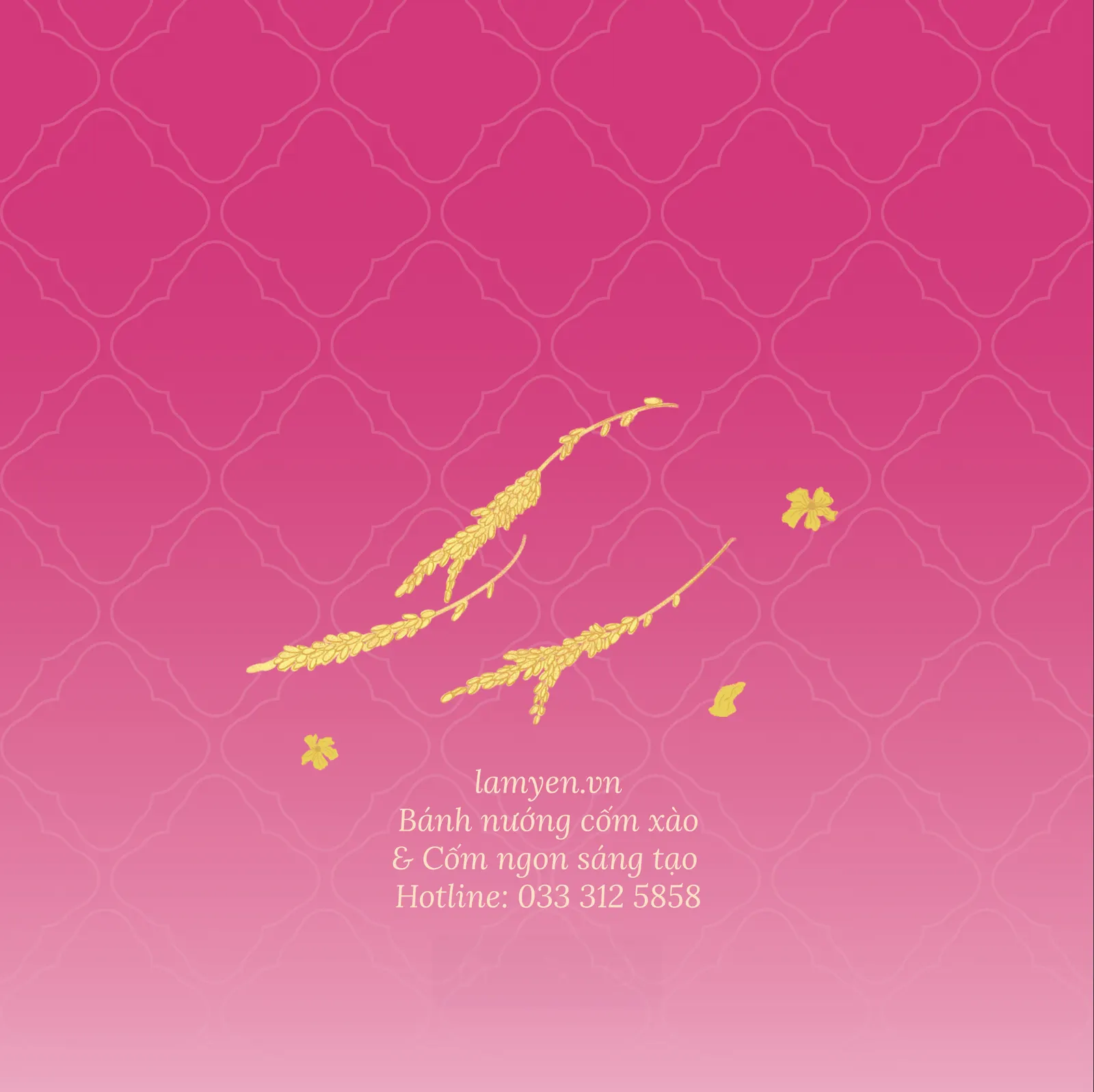
The signature paper bag, front: a pale green-to-cream gradient with a soft quatrefoil pattern and the golden “Lam Yên” logo.The signature paper bag in pink with the golden “Lam Yên” logo on the quatrefoil pattern.The signature paper bag, back: a pink gradient with a gold rice-stalk ornament and the shop details in small cream letters.
The back of a pink seasonal paper bag: a rice plant in a golden vase, golden petals and swallows, inside a lace-like quatrefoil border.The front of the pink seasonal paper bag: a plain pink panel with a lace-like quatrefoil border and the golden “Lam Yên” logo.A dark green seasonal paper bag: a golden moon, ribbons of pale cloud, blue swallows and a four-lobed window onto green rice terraces, with the golden “Lam Yên” logo.The front of the dark green seasonal paper bag: a plain green panel with a faint pattern band and the golden “Lam Yên” logo.

The pattern continued to inspire the designs of subsequent seasonal bags.

If luxury brands inspired the design of this paper bag, Marou inspired me to turn a simple box into a gift through its wrapping. 🫡

BRAND’S IMAGE

Shaping the brand’s image

  • We started with an Indochine mood: rich and elegant, aiming at a mid-to-high price.
  • It is good for big campaigns, brand building, making it “a gift worth owning”
  • But it’s hard for selling them daily…

Show it the way it’s meant to be enjoyed

At first, the brand owner told me: “Our kitchen isn’t moody and traditional like on Pinterest.”

I said: “Let me figure it out. I just want to immerse myself in cốm first.”

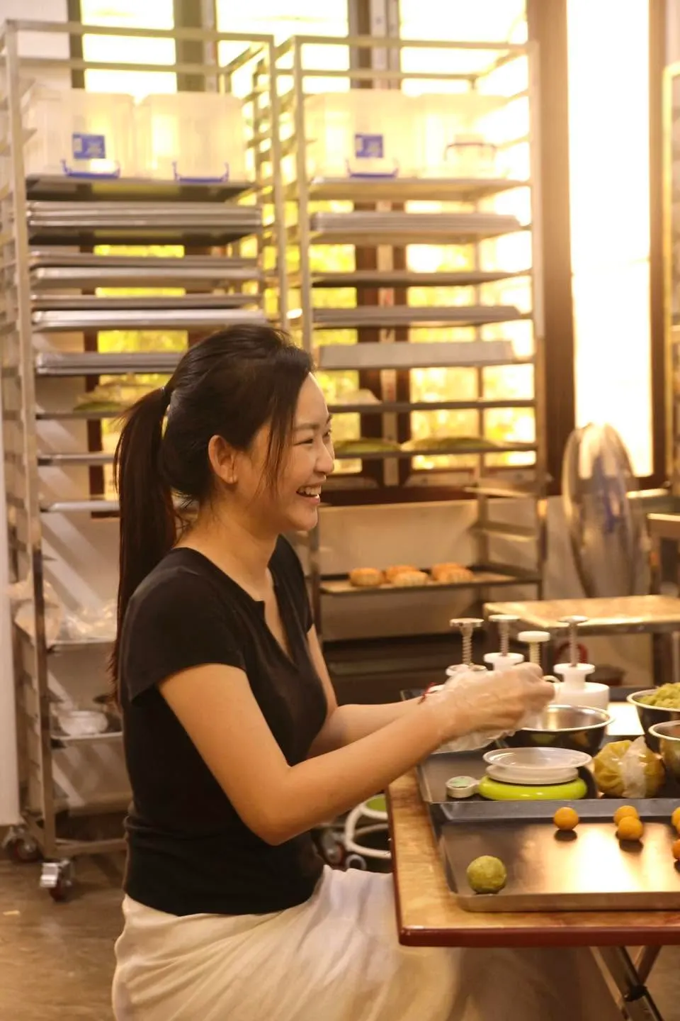
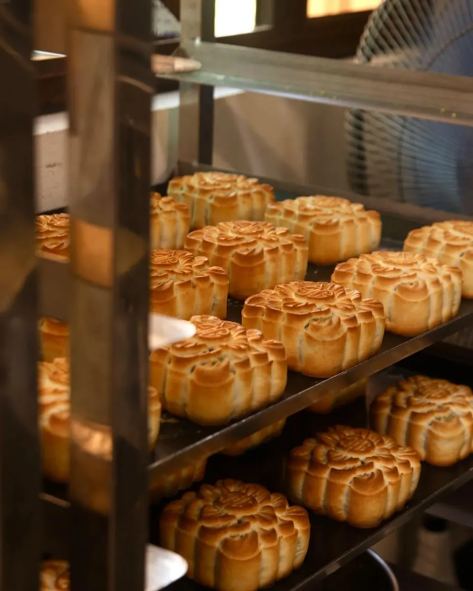
A baker in a black T-shirt smiling as she works at a table in front of tall racks in the Lam Yên kitchen.Rows of freshly baked mooncakes on the shelves of a baking rack.

So I spent my days in the kitchen, watching the bakers, getting to know the product. And I found something.
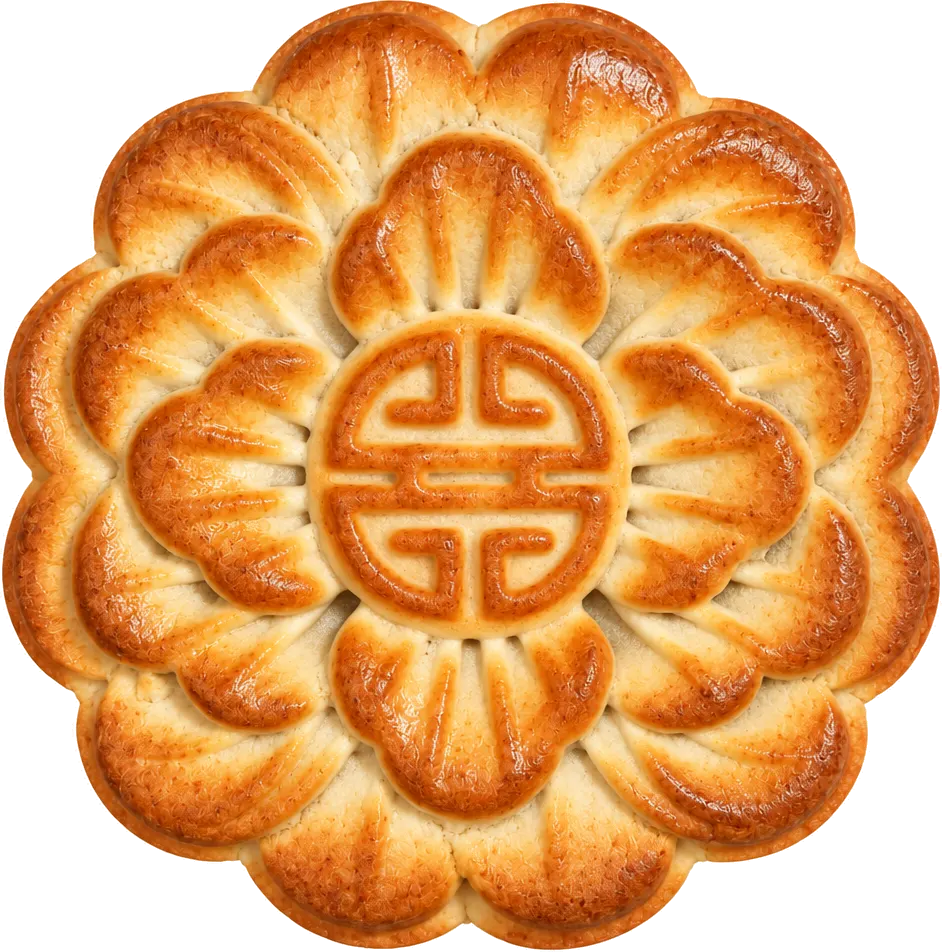
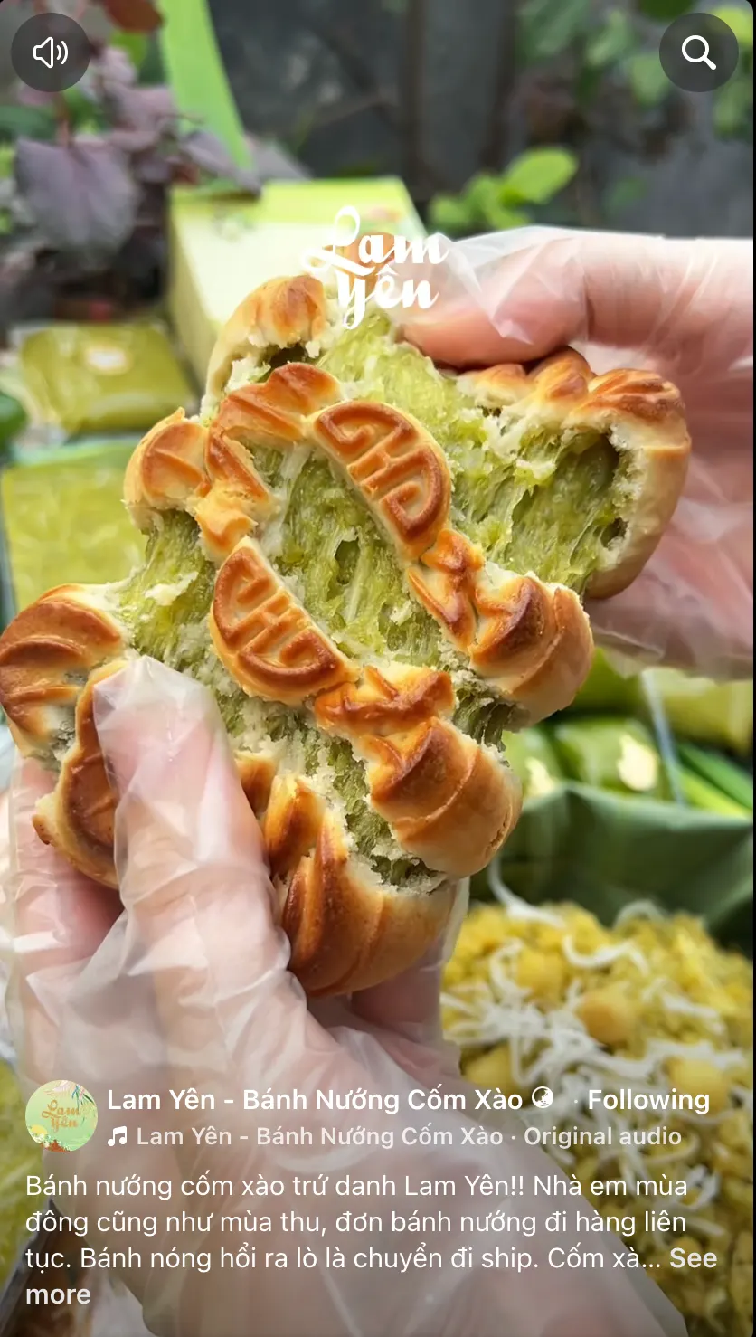
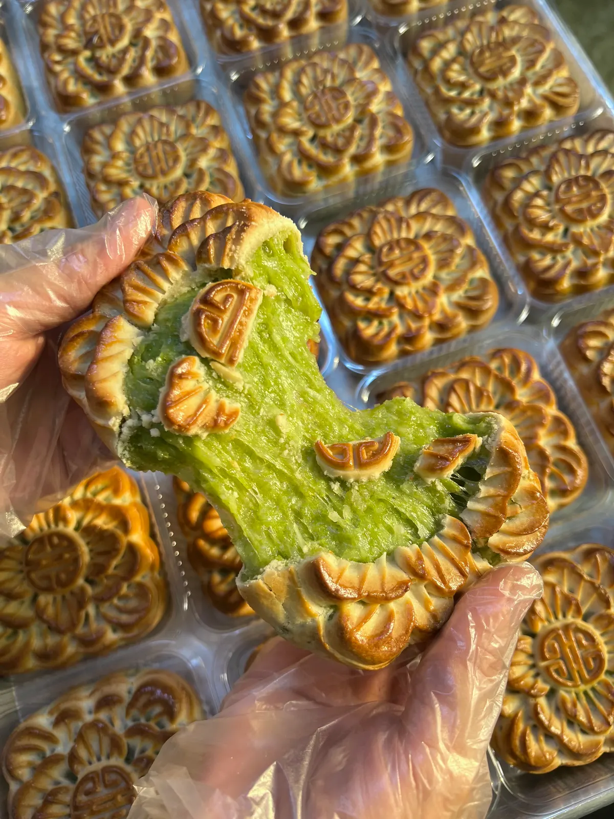
Our mooncake has one true way to be enjoyed:break it, and pull it apart.
No knife, no neat square slices like in every mooncake photo. Just fresh, warm, and the filling flowing out behind a crisp crust.

So that’s how I shot it, right there in the kitchen.

Rounds of green cốm filling lined up on a dark tray.

That small gesture became our signature. Customers and reviewers tried it and said,

“Oh, I see them do it like this.”

“Looks insanely delicious.”

Working side by side with the bakers, I made a whole library of “selling content”: making videos, food-porn close-ups, imperfect on purpose. It was cheap to produce and worked well in ads.

It brought people closer to the product, close enough to make it part of their day.

Through consistent content and repetition, we gradually made Lam Yên synonymous with Cốm Xào Mooncake.

BRAND’S IMAGE

Shaping the brand’s image

So I learned to speak in 2 registers:

  • Casual “making” content for daily selling
  • Indochine-styled imagery for big campaigns and brand building.
Two gloved hands pulling a baked mooncake apart, bright green filling stretching between the halves, with a tray of mooncakes behind.Two mooncakes, one on a small stand, on a red wooden table with a pale green cloth and leafy branches in front of dark foliage.

BRAND’S VOICE

Forming the brand’s voice

Lam Yên’s founder started as an online baker, selling her cakes to people nearby. With the soul of a baker who wants to share her happiness, I leaned into that and shaped the voice of Lam Yên.

Also by talking with customers on social media, Lam Yên found its voice: a cordial, welcoming and confident baker.

“Cô bán hàng đon đả, mến khách & tự tin.”

Keep the season going

Small campaigns, new demand

Tết 2025

Launching Mochi, with a reel series

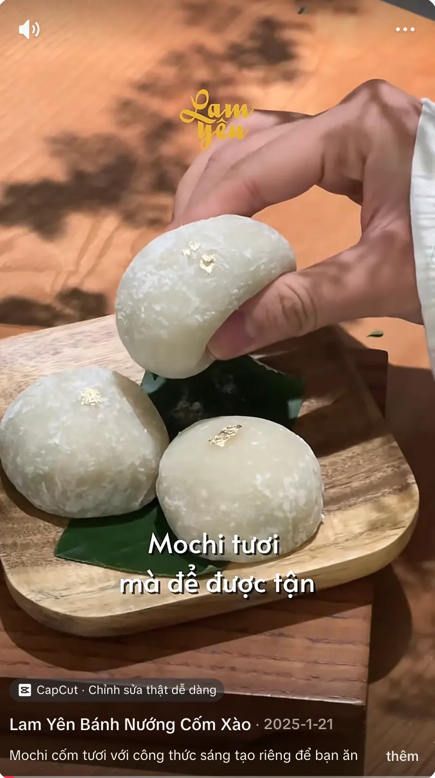
We introduced Cốm Mochi as a Tết gift set, since it keeps longer and is stored differently from our other cakes. But we also wanted it known as something worth eating in its own right, and to keep confirming Lam Yên’s lead in tasty, creative cốm.

So one of our standout pieces of communication was a reel series.

The challenge: how do you talk about one simple product across a long run of reels?

My answer was to break the cake down into its parts. Each group of reels took one part and one angle: its origin, its inspiration, how it’s made, the flavour, the texture… And, one more thing: I wasn’t shy about repeating the key signatures: “thơm ngậy”, “dai dẻo”, “không ngọt”, “không bứ”,… I wanted people to remember about our Cốm Mochi.

We have led the way in creative cốm innovation.

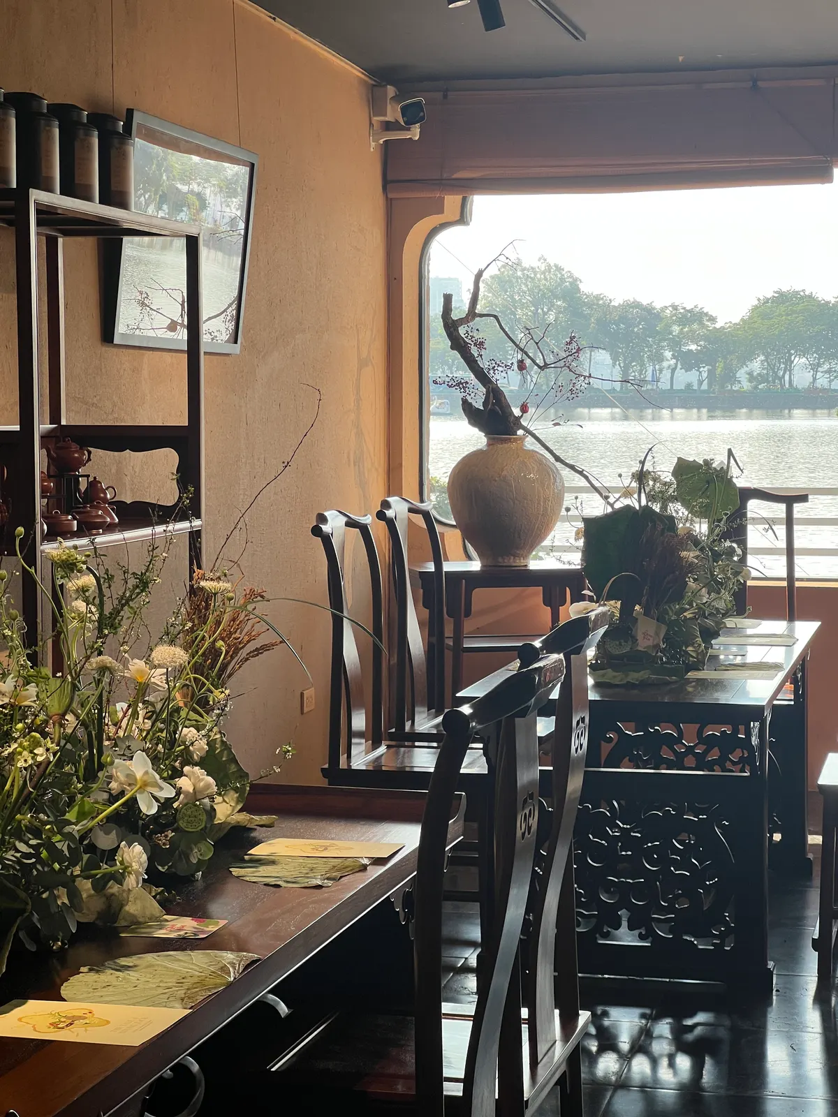
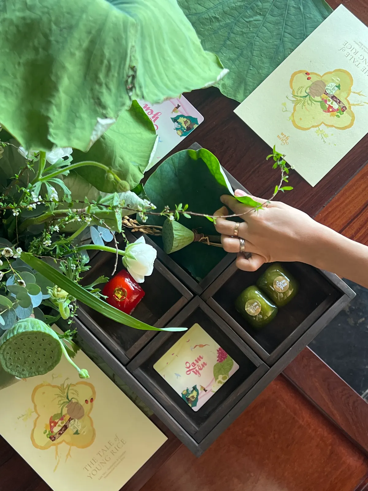
A quiet dining room with carved wooden chairs and a long table of flowers, beside a window over a lake.A guest photographing a wooden tray of mooncakes with her phone, among lotus leaves and flowers.A hand arranging a lotus leaf and flowers over a dark wooden tray of small cakes, with printed cards beside it.A printed invitation card lying on a dark wooden table between dried lotus leaves.

Collab with Gia Restaurant (opens in a new tab)

A workshop “The Tale of Young Rice”

  • Part of a curated Vietnamese culinary tour for a group of VIP guests.
  • It rooted Lam Yên in its traditional side.
  • My role: setting up the concept with the team, and running the workshop.

The Mid-Autumn seasons

2024

Cốm Mùa Trăng

  • For our first Mid-Autumn season, we placed Lam Yên in iconic Hanoi settings: the Old Quarter, humble cốm street vendors,… styled in an Indochine mood.
  • Packaging:
    • Elaborate gift boxes
    • Hand-drawn Hanoian illustrations

2025

Cốm Trăng Tròn

  • First physical store opening
  • Packaging Change:
    • Simple gift box blank
    • Different version wraps for the boxes
  • I also took on the in-store experience and designed the space for new store for a while

2026

With my move approaching, I was involved in the early and mid-stages of this year’s Mid-Autumn campaign.

  • Early stage: I joined the campaign for the packaging concept and the main photoshoot.
  • Mid-campaign: I joined the TVC production, checking the brand’s styling and the product-making methods on set.

2024 · Cốm Mùa Trăng

A street vendor in a conical hat crouching between two shoulder-pole baskets of greens, with a woman in a yellow áo dài standing by a wrought-iron gate.
A conical hat used as a tray, holding a green Cốm Mùa Trăng box, with a woman in a yellow áo dài behind it.
A woman in a yellow áo dài sitting by a basket of leaves, lifting out a Cốm Mùa Trăng box.
An open pink box of pastel mooncake boxes under a printed lid lettered “Cốm Mùa Trăng”.
The Cốm Mùa Trăng box, covered in illustrated village scenes, lying on a cream cloth on a wooden table.
A shoulder-pole basket heaped with green and pink gift boxes, carried by a woman in yellow.
A woman in yellow sitting on the pavement between two baskets of leaves, one arm raised.
A hand sliding a small box into an open gift box with an illustrated lid and rows of pastel boxes.

2025 · Cốm Trăng Tròn

After four years of selling online and one year of marketing efforts, Lam Yên opened its first physical store in Hanoi.

The white “Lam Yên” sign on the green shop front, under strings of red flags.
Customers queuing outside the green shop at 57 Phố Huế under red lanterns, motorbikes parked in front.
Pale green paper bags lined up on a counter beside the shop window.
Woven baskets of festival lanterns and toys on a counter under a green shelf.
Plants and flowers in the shop window, with a framed photo of baked mooncakes.
A woman holding up a framed photo of mooncakes on a rack against a pale wall.
Inside the shop: flowers in the foreground and a screen showing cốm cakes.
A line of customers along the street below red flags and lanterns outside the Lam Yên shop.
A shop assistant in a pink shirt arranging flowers on a wooden counter in the green shop.

2026 · Cốm Đặc Sản

An open box of Cốm Đặc Sản beside a closed one and a mooncake on a small stand, next to a vase of white lotus buds, against a dusty-pink wall.
Close-up of the Cốm Đặc Sản box: a phoenix with outspread pastel wings among clouds.
Close-up of the title “Cốm Đặc Sản” on the yellow lid of the box.
The Cốm Đặc Sản box standing on a dark carved stand against a dusty-pink wall.
The Cốm Đặc Sản box lying at an angle on a dark wooden table, white lotus buds above it.
White lotus buds in a dark blue vase on a small table, with Cốm Đặc Sản gift boxes and a mooncake on a stand beside it, against a dusty-pink wall.

Behind the scenes

The crew gathered around a set with a yellow painted backdrop and a softbox light.
A tablet on a stand showing a mooncake picture, in a courtyard garden under a tree.
A tablet on a stand beneath a honeycomb softbox, showing a golden picture.
A cameraman beside a set of stacked gift boxes in front of a painted phoenix backdrop.
A film camera on a rig in a courtyard, facing a table of gift boxes and a woman sitting behind it.
A laptop on a tray showing photos, a printed contact sheet beside it, and a camera operator behind.
The photoshoot team working on a lotus pond, with a camera, a reflector and an umbrella.

What changed

  1. From a seasonal product to a daily sweet treat.

  2. A brand known from the North to the South as a pioneer of creative cốm.

  3. Sales doubled with each Mid-Autumn.

  4. Content that set the pace: daily “making” content, cheap to produce, effective for both branding and marketing.

  5. Pattern and design approach that shaped a clear, standout brand image and gave future packaging a starting point.

  6. Lam Yên made its way to the U.S. Embassy in Vietnam, where KOL Mei Chan introduced it as a taste of Vietnamese tradition. link (opens in a new tab)

Day by day, I felt myself putting down roots in Hanoi by building Lam Yên. I worked with a focus on craftsmanship and specialty ingredients, brought my ideas to life, and sharpened my branding and marketing skills along the way. And I got to help carry our mooncakes beyond Hanoi.

When I first walked in, there was little in the kitchen and just one baker to welcome me. Now the kitchen has grown, with machines and bakers working in shifts. I watched our first store open, with a line of customers stretching out the door, and Lam Yên grow into a name associated with Hanoi’s gifting culture.

That’s where the culture lover in me found her kitchen.

A woman in a green dress and a conical hat, seen from behind on a busy Hanoi street, carrying a green gift box; the street is in black and white.
↑ Contents

Becoming whole in F&B

Differentkitchens

Short projects, different roles that widened my view of F&B

  1. 01Golden Gate JSCMarketing Assistant to the Brand Manager · ContractMar – Jul 2024
  2. 02Lam Yên & 123 RestaurantOperations Assistant to the Brand Owner · Part-timeSep 2024 – Jun 2025
  3. 03Mono Coffee LabMarketing Specialist (project-based) · ContractMay – Oct 2025

Golden Gate JSC (opens in a new tab)

Mar – Jul 2024Marketing Assistant to the Brand Manager · Contract

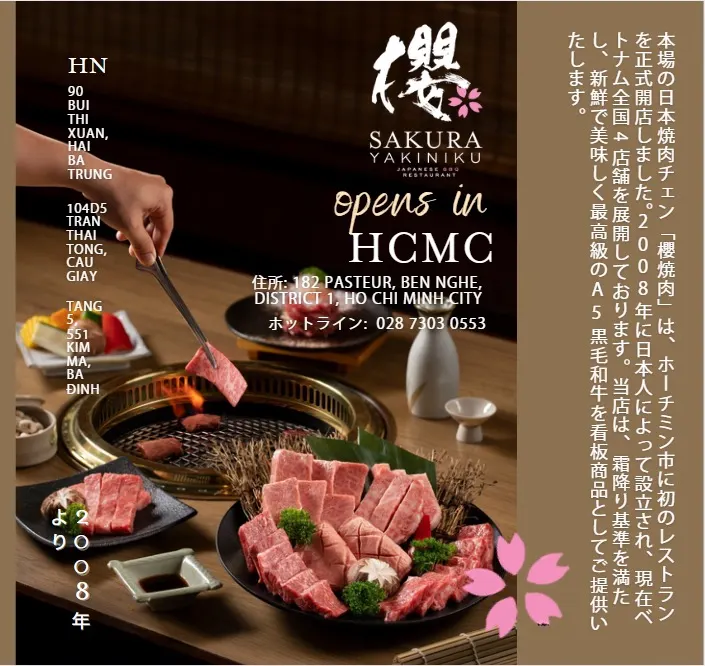
Grand Opening Campaign for Sakura Yakiniku (opens in a new tab)

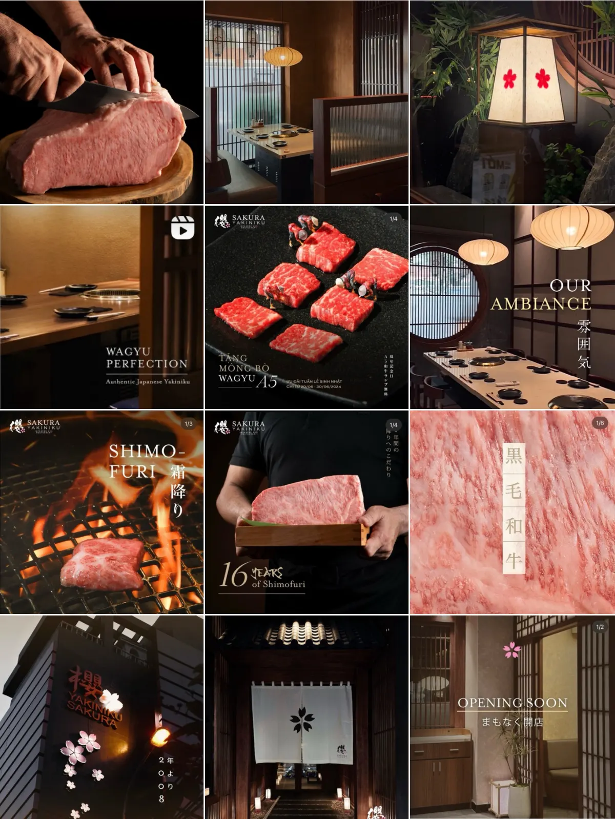
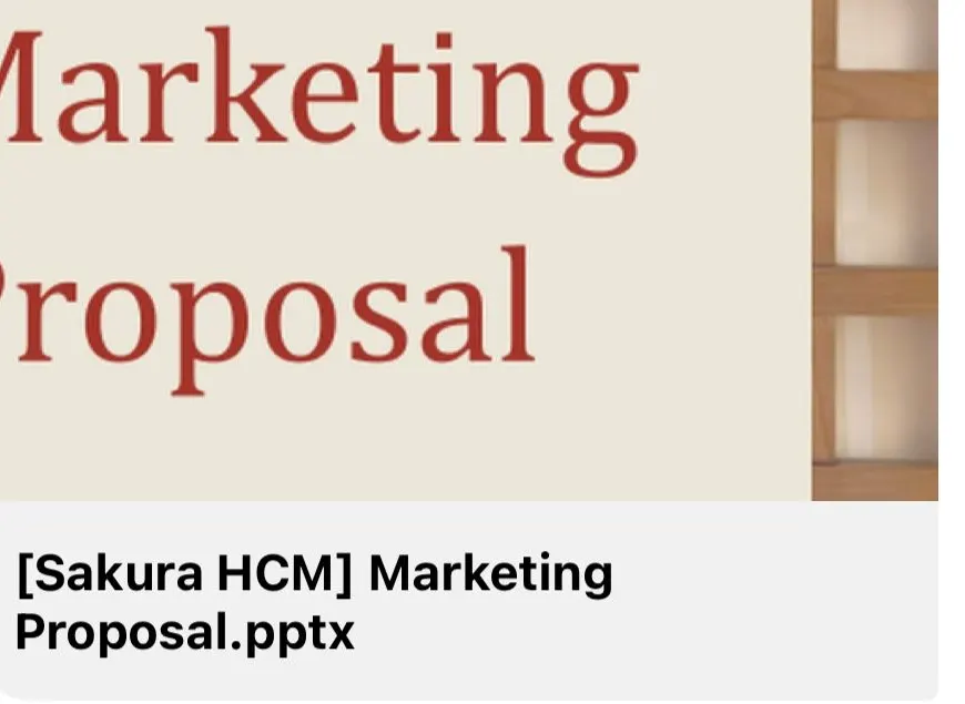
A grid of twelve Sakura Yakiniku social posts: wagyu cuts, dark private dining rooms, a paper lantern and “Opening soon”.A slide titled “Marketing Proposal” in a file preview named “[Sakura HCM] Marketing Proposal.pptx”.A Sakura Yakiniku poster: “opens in HCMC”, a hand lifting a slice of wagyu over a grill and plates of raw beef, with Japanese text down the right edge.The cover of a document, “Sakura video TikTok editing guide”, with an orange header and a blurred contents page below.A slide: the red 7Fuku Izakaya logo above the words “Re-launching plan proposal”, on a cream ground with pale waves.
  • Developed marketing proposals for a range of Japanese brands.
  • Built brand strategy frameworks and launch/relaunch campaign plans.
  • Produced video content, and wrote editing guidelines for the team.
  • Learned to plan and allocate a large campaign budget.
  • Learned to coordinate with the Northern and Southern regional teams, keeping brand voice and visuals consistent across markets.

At this scale, the job is less about shaping a brand and more about keeping it in line with the budget, targets, and overall scale.

Lam Yên and 123 Restaurant

Sep 2024 – Jun 2025Operations Assistant to the Brand Owner · Part-time

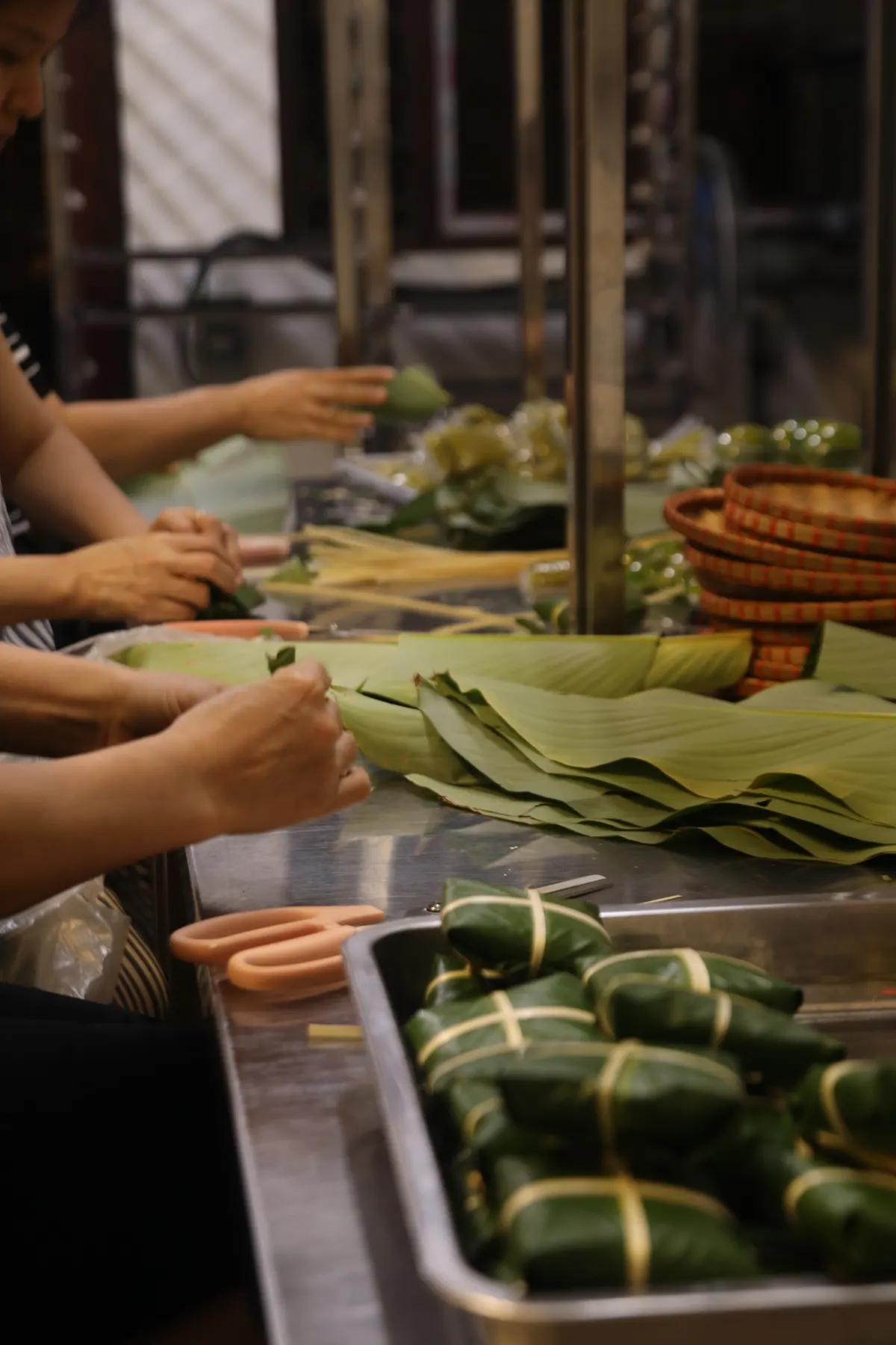
Hands folding green leaves around cakes at a steel counter, with wrapped parcels in a tray in front.

Lam Yên

Joined operational meetings and took on responsibilities across different areas, especially during peak seasons (order distribution, queue management,…)

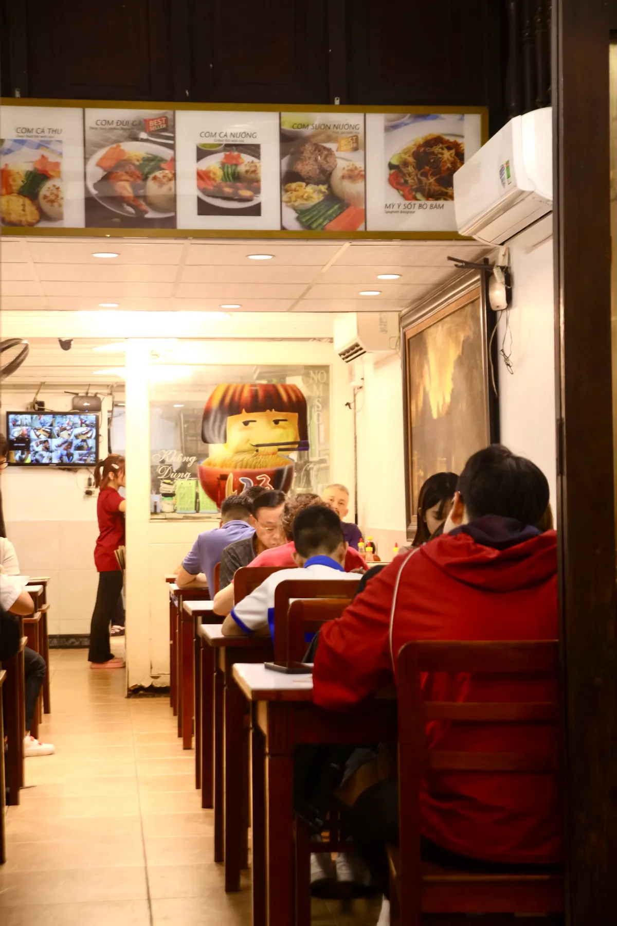
A narrow, bright restaurant with customers at wooden tables, a waitress in red and a cartoon face painted on the wall.

Alongside operational support, I also took on social media marketing for the restaurant for a period of time.

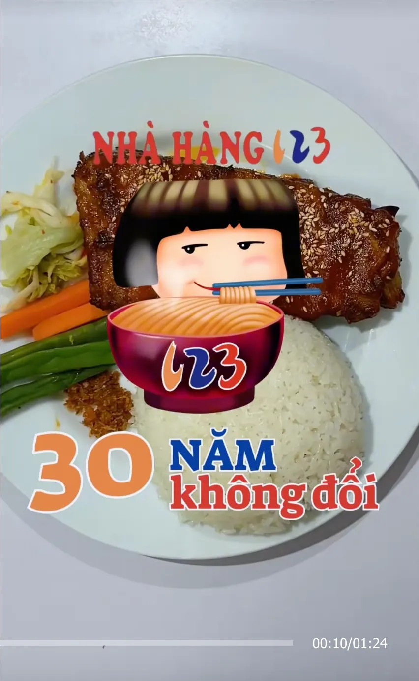
One of the highlights was a TikTok initiative.

A still from the 123 Restaurant TikTok: a plate of grilled ribs and rice with the cartoon logo girl and a bowl of noodles, and the words “30 năm không đổi”.

Different roles got me thinking beyond marketing.

Inside Mono Coffee Lab at night: a barista in a striped apron leans over the counter, a small girl drawing behind it, shelves of coffee bags and a glowing arch in the wall.

May – Oct 2025Marketing Specialist (project-based) · Contract

If the heart of Lam Yên is the product, the heart of Mono is the service.

Mono is already good at expressing its brand spirit through warm service and authentic stories on social media – an energetic, warm-hearted friend.

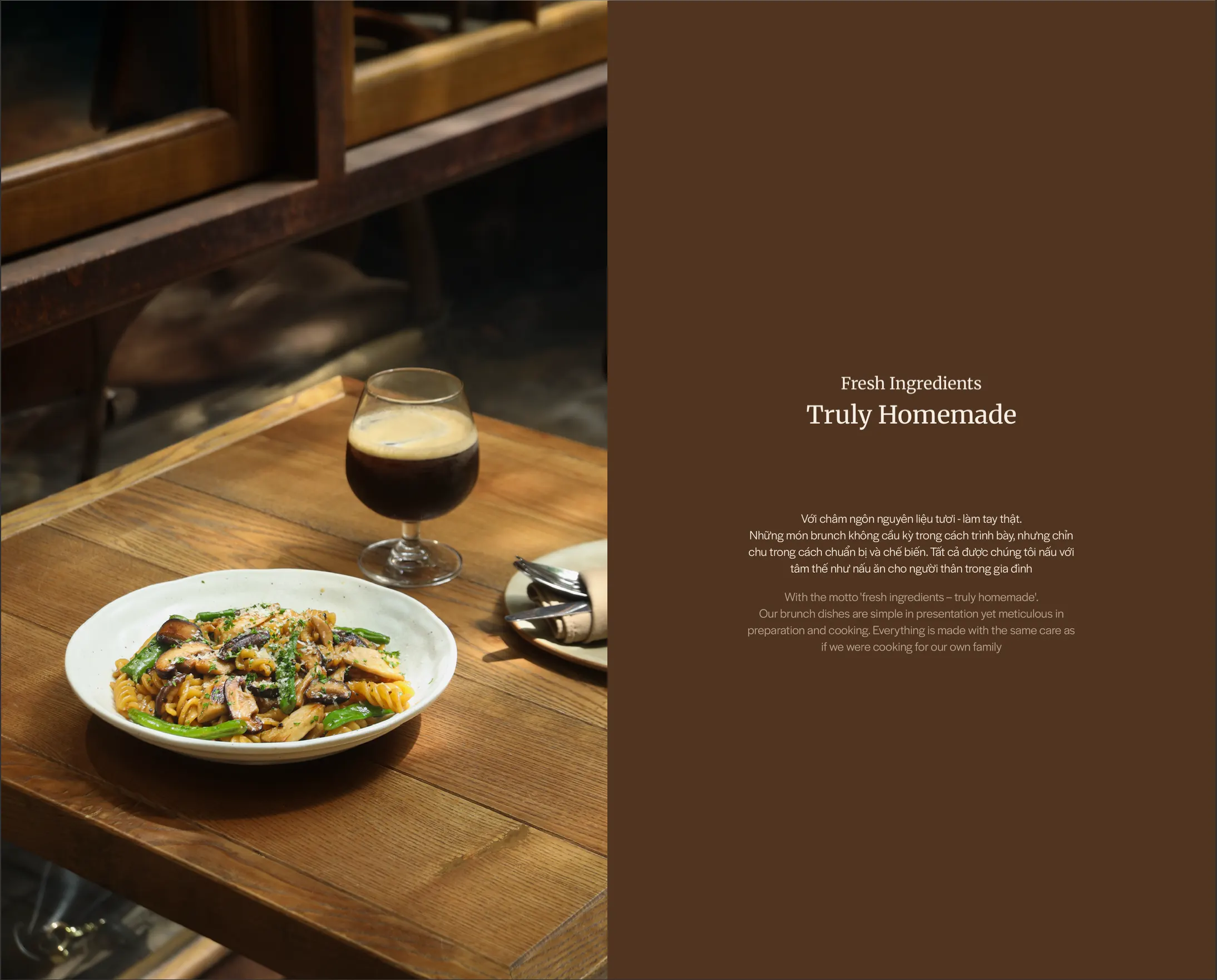
Beyond the experience, Mono also has a strong offering of house-made products, from coffee and cakes to brunch.

The brief

Make Mono’s house-made products more appealing and bring them closer to its guests.

02

In the café

  • flexible POSM on the tables
  • an iPad at the cashier
  • new menu experiences
A printed Mono Coffee Lab menu on a wooden clipboard: “home-lab brunch 8AM - 8PM” and a drawing of a cook in an apron and cap tossing a pan over flames, dishes along the right edge.

Mono Brunch Menu (Draft)

Creative Direction & Design Refinement

03

Summer Brunch launch

guest opinion cards in store first, then the social push

1 / 9

It’s not just a shelf of products like at Lam Yên. Mono filled in a part of my marketing approach that was missing.

Here, a customer meets the brand at every step: the table, the menu, the cashier, the staff,…

And it showed me that what works for one brand doesn’t necessarily work for another.

NextOff the menu
Side note